


Ready to write Python code 4x faster?
Pivot tables are the classic requirement on a job posting that you learn the day before the interview. Nobody uses them until you need them, and then they become your best friend. Pivot tables were first featured in Lotus, the precursor to Excel, and then became popularized in Excel 5.
Pivot tables take a large dataset, groups the data into buckets based on a specified attribute, and calculates summary information for each of those groups. Let’s say a shopkeeper was looking at a dataset with their daily sales for the year and then pivoted that data to show the average sales for each month. All of the line items in the original dataset are still represented in the pivot table, even though the dataset went from 356 lines to 12. This is an important distinction from a filter, which actually changes the dataset that is being represented.
Another reason to use pivot tables is for speed. If you are trying to find relationships (and you don’t want to count by hand) pivot tables are often the fastest way. But even the slickest of Excel pivot tables can be painfully slow — If you’ve ever accidentally pressed Enter in Excel and it recalculates your pivot table which took 10 minutes, you know this pain. If you have to stop in the middle of your analysis so your pivot table can load, it’s time for a change.
This is why pro-pivoters (pivot pros?-- waiting for the focus group to get back on this one) are beaming towards Python. Python pivot tables are faster, can handle larger datasets, and allow for automation of future pivot tables.
Let’s dive into the code required to make a Pivot Table in Python:
pivot_table = df.pivot_table(
    index=['POSITION'],
    values=['POINTS'],
    aggfunc={'POINTS': ['mean']}
The code above is for a pivot table I made about the NBA statistics for this season. I wanted to know which position, across all teams, is averaging the most point per game. Here are the key components:
- pivot_table = df.pivot_table — the left half of the equals sign is where we name our new pivot table, while the right half tells us what dataset this pivot table is being built from
- index = [’POSITION’] — here I have selected my POSITION column as the index column. This is equivalent to deciding the Row value in a Excel pivot table
- values = [’POINTS’] — here I select POINTS as the values to aggregate on
- aggfunc={'POINTS': ['mean']} — here I select the aggregation type as “mean”
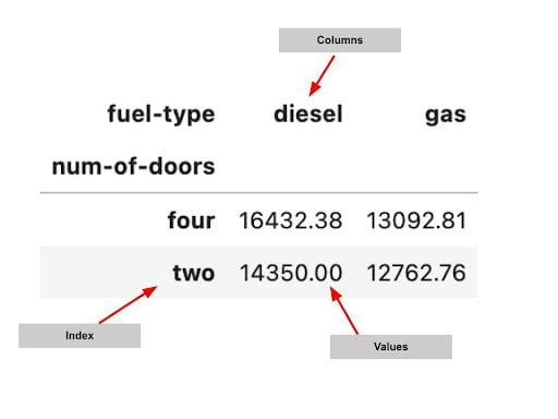
Caption* Basic anatomy of a pandas pivot table. | Image: Rebecca Vickery
If you’ve never used Python before, the above could be a little bit daunting, but I guarantee if you read it through a couple times, you’ll feel your familiarity grow.
Styling a Pivot Table
One reason people like Excel for pivot tables is that styling them is very easy. Pivot tables are a great, simple way to share insights so they are often sent to colleagues. You can actually do all the same styling on your Pandas pivot table, but the code required is not geared towards beginners. Though, here are a few tricks for styling:
Styling a DataFrame uses the [DataFrame.style](<http://DataFrame.style>) property. You can use the style property to set both conditional and non-conditional formatting. For example you could define a function that highlights the maximum value in each column.
def highlight_max(s):
  is_max = s == s.max()
return ['background-color: yellow' if x else '' for x in is_max]
Then you would attach this function to the [DataFrame.style](<http://DataFrame.style>) property
df.style.apply(highlight_max)
If this looks daunting to you, don’t worry! Styling dataframes even trips up more advanced Python users. Mito is a great alternative.
Here’s how to add accounting formatting to your pivot table with Mito:
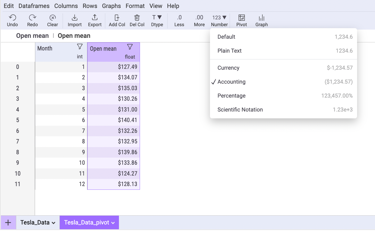
And here is the styling code that Mito will write for you:
# Formatted dataframes. View these styling objects to see the formatted dataframe
Tesla_Data_pivot_styler = Tesla_Data_pivot.style\\
    .format(lambda val: '${:>,.2f}'.format(abs(val)) if val > 0 else '$({:>,.2f})'.format(abs((val))), subset=['Open mean'])
Graphing a pivot table
Similar to styling, there is a good amount of syntax required here. No need to memorize it all, but I do recommend getting a good understanding of the code.
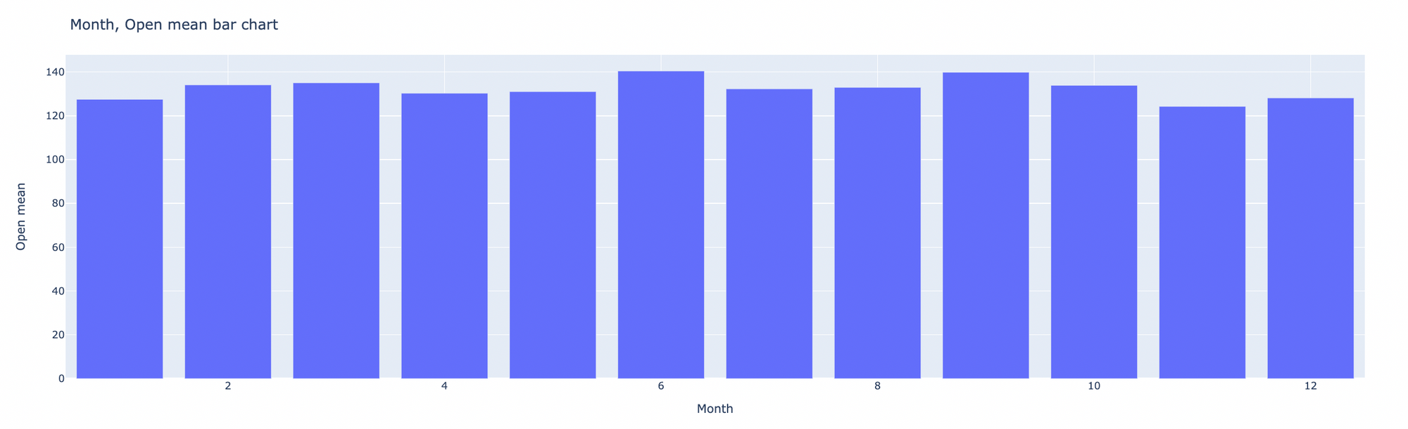
Here is the pivot table above represented as a bar chart using Plotly, a great open source graphing package in Python.
Here is the code for this visualization:
import plotly.express as px
# Construct the graph and style it. Further customize your graph by editing this code.
# See Plotly Documentation for help: <https://plotly.com/python/plotly-express/>
fig = px.bar(Tesla_Data_pivot, x='Month', y='Open mean')
fig.update_layout(
    title='Month, Open mean bar chart',
    xaxis = dict(
        showgrid=True,
    ),
    yaxis = dict(
        showgrid=True
    ),
    barmode='group',
    paper_bgcolor='#FFFFFF'
)
fig.show(renderer="iframe")
👀 Yes, that looks massive, but don’t worry you can still be dangerous with Python pivot tables without memorizing this. Let’s break it down a little bit.
First we are importing Plotly:
import plotly.express as px
Next we select our chart type as “bar” as well as which columns to set as our axes:
fig = px.bar(Tesla_Data_pivot, x='Month', y='Open mean')
Then we select the title and decide whether or not to have gridlines in the X axis:
fig.update_layout(
    title='Month, Open mean bar chart',
    xaxis = dict(
        showgrid=True,
		)
And the same for the Y axis:
yaxis = dict(
        showgrid=True
    ),
Selecting the bar mode and the background color:
),
    barmode='group',
    paper_bgcolor='#FFFFFF'
Finally, this renders your visualization, if you want to see it in the notebook:
fig.show(renderer="iframe")
Exporting a pivot table
Remember, that since pandas pivot tables are just regular pandas dataframes, we can use any of the standard pandas functionality on our pivot table
One nice thing about Pandas is that there is a one line function to export your Pandas pivot table to a CSV file.
Exporting to a CSV
df.to_csv(r'Path where you want to place the CSV file\\File Name.csv', index=False)
Exporting to XLSX
df.to_excel(r'Path where you want to place the Excel file\\File Name.xlsx', index=False)
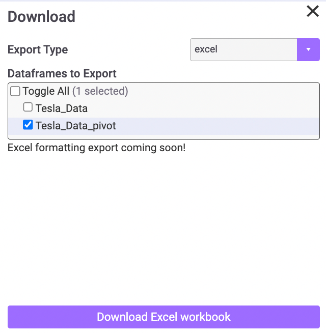
Mito also provides a simple interface to export any dataframe without needing to write any code. Here you can see the export menu, where you can select between CSV or Excel:
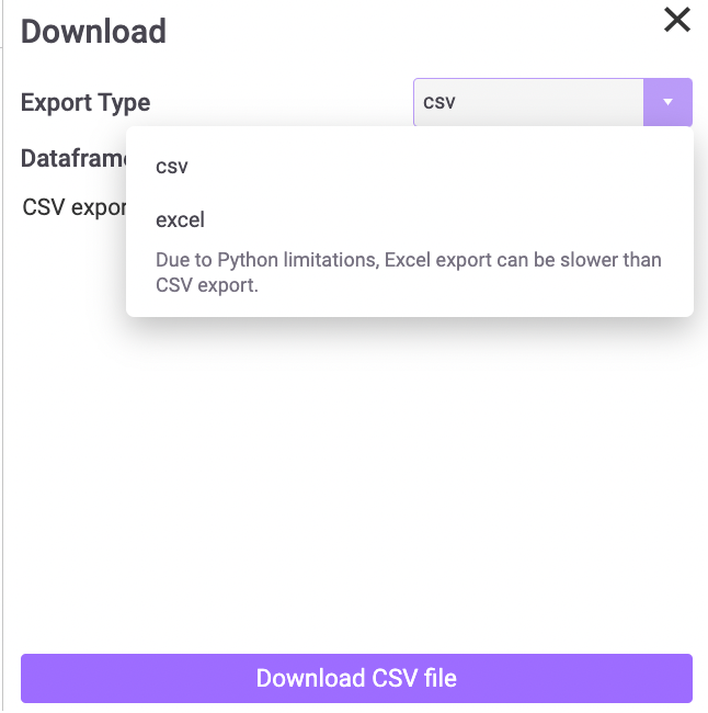
If you select Excel, you can then decide which dataframes you want to include as tabs in the same workbook (this code can be tricky to write yourself).
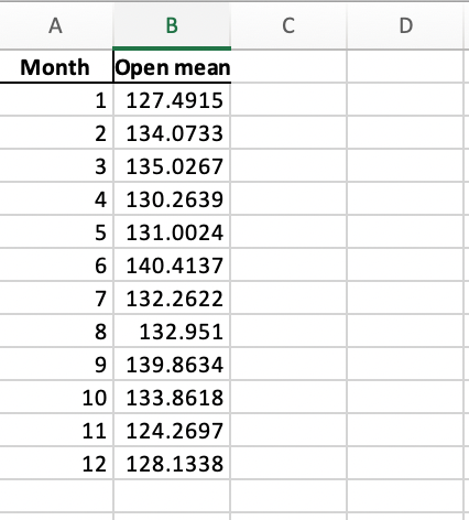
Here is what your exported pivot table will look like in Excel:
If you have any questions on Python pivot tables, please reach out to jake@sagacollab.com :)
More Like This
Automating Spreadsheets with Python 101
How to tell the difference between a good and bad Python automation target.
10 Mistakes To Look Out For When Transitioning from Excel To Python
10 Common Mistakes for new programmers transitioning from Excel to Python
Research shows Mito speeds up by 400%
We're always on the hunt for tools that improve our efficiency at work. Tools that let us accomplish more with less time, money, and resources.
3 Rules for Choosing Between SQL and Python
Analysts at the world's top banks are automating their manual Excel work so they can spend less time creating baseline reports, and more time building new analyses that push the company forward.